Motorists App
I spoke to a few people about an idea for an app I had and if they would be interested in using it. From there I learned the app I had considered making would not be used as much as another which was suggested to me. I then began researching what was already available and what would be the right questions to ask people to learn their needs. Once I had the questions ready, I conducted surveys and interviews and began my research synthesis to get a deeper understanding of the direction and feature priorities for the early version of my app. With those new insights I was able to begin designing a flow and put together a wireframe ready for a new round of user testing. My skills as a designer/developer were very useful as I already had a solid knowledge of usability and guidelines. As well as research gathering and testing methods, I learned which questions to ask so as not to confuse people. For example, I asked "what tools do you use when sorting your maintenance schedules?" and instead of answers such as "I keep notes on my phone or calendar" I received answers like "spanner" or "paddock stand". What I should have asked was "what is your current method of keeping track of your insurance, servicing, mot and tax?"
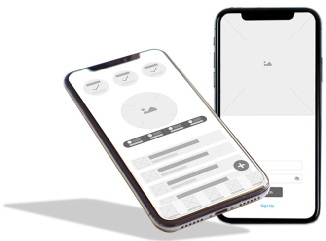
The most interesting insights from the user testing was 40% of users were missing the sign-up button and there was a desire for a more simplified colour picker; users preferring to not be overwhelmed with too much choice. Having already learned that a tertiary button was better to allow the primary button to stand out more, I had to go against that guideline and make the sign-up button a secondary style instead. I also had to make a judgement about which difficulties were due to the test environment and which were due to the app layout. This was due to users performing the testing on a variety of devices and the prototype wasn't as responsive as I would have liked. It caused users some frustration with the need to scroll a lot. The testing environment also hid some of the bottom portion of the login and sign-up page which made the test a less realistic representation.
From the interview and surveys, the final app has been molded by the insights which were revealed during each user testing phase. The app met the users' key needs identified in the initial research gathering, the result being a very keen interest in using the app; to the point where I had people saying they would pay for an app like this.
To view the portfolio for this project, please click either link: PDF | Powerpoint